Settings controls put a block’s options in the editor sidebar, where authors expect them. First, attributes in block.json declare what the block stores. Next, InspectorControls moves your fields into the sidebar instead of the canvas. Then PanelBody groups them, while TextControl and ToggleControl collect the values. Finally, setAttributes() saves each change, so the block redraws immediately.
This tutorial continues the Notice block from creating a custom Gutenberg block without a build step. Start there if you have not built the plugin yet.
Requirements for the settings controls:
- WordPress 6.7 or newer (tested on WordPress 7.0.4).
- PHP 8.0 or newer (tested on PHP 8.5.7).
- The ndriel-blocks plugin from part one, already active.
- Still no build tool. The controls come from
wp.components, which core already loads.
How To Add Settings Controls to a Gutenberg Block.
The objective is two options for the Notice block: a heading the author types, and a toggle that switches to warning colours.
Step 1.
First, declare the new attributes in notice/block.json. Each one needs a type, and a default keeps the block usable the moment it is inserted.
"attributes": {
	"message": {
		"type": "string",
		"default": "Heads up: this box came from a custom block."
	},
	"heading": {
		"type": "string",
		"default": "Note"
	},
	"isWarning": {
		"type": "boolean",
		"default": false
	}
}
Step 2.
Next, add wp-components to the script dependencies. The controls live in that package, so the editor must load it first.
wp_register_script(
	'ndriel-notice-editor',
	plugins_url( 'notice/index.js', __FILE__ ),
	array( 'wp-blocks', 'wp-element', 'wp-block-editor', 'wp-components' ),
	'1.1.0',
	true
);
Also bump the version string. Otherwise browsers keep serving the cached copy of the old script.
Step 3.
Then pull the controls out of the global objects at the top of notice/index.js.
( function ( blocks, element, blockEditor, components ) {
	var el = element.createElement;
	var useBlockProps = blockEditor.useBlockProps;
	var RichText = blockEditor.RichText;
	var InspectorControls = blockEditor.InspectorControls;
	var PanelBody = components.PanelBody;
	var TextControl = components.TextControl;
	var ToggleControl = components.ToggleControl;

	function classes( attributes ) {
		return attributes.isWarning ? 'ndriel-notice is-warning' : 'ndriel-notice';
	}
The small classes() helper matters more than it looks. Because both edit and save call it, the two can never disagree.
Step 4.
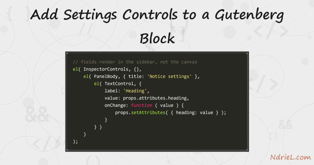
Next, build the sidebar inside edit. Anything wrapped in InspectorControls renders in the sidebar rather than the canvas.
var inspector = el( InspectorControls, {},
	el( PanelBody, { title: 'Notice settings', initialOpen: true },
		el( TextControl, {
			label: 'Heading',
			value: props.attributes.heading,
			onChange: function ( value ) {
				props.setAttributes( { heading: value } );
			}
		} ),
		el( ToggleControl, {
			label: 'Warning style',
			help: 'Use the red warning colours instead of the default.',
			checked: props.attributes.isWarning,
			onChange: function ( value ) {
				props.setAttributes( { isWarning: value } );
			}
		} )
	)
);
Then return the sidebar and the block together. A fragment lets edit hand back two things at once.
var body = el( 'div', useBlockProps( { className: classes( props.attributes ) } ),
	el( 'strong', { className: 'ndriel-notice__heading' }, props.attributes.heading ),
	el( RichText, {
		tagName: 'p',
		value: props.attributes.message,
		onChange: function ( value ) {
			props.setAttributes( { message: value } );
		}
	} )
);

return el( element.Fragment, {}, inspector, body );
Finally, mirror the same structure in save, and add the warning colours to notice/style.css.
.ndriel-notice.is-warning {
	border-left-color: #b3261e;
	background: #fdecea;
}

.ndriel-notice__heading {
	display: block;
	margin-bottom: 0.25rem;
}
Result of the settings controls.
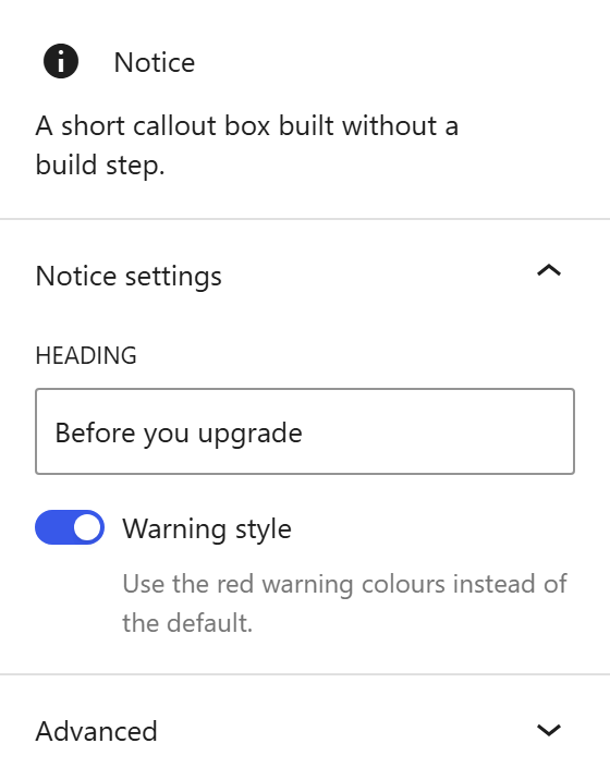
Select the block and the sidebar shows the panel. Type in the heading field and the block updates as you type, because setAttributes() re-renders it.
The values land in the block comment, so WordPress can restore them later.
<!-- wp:ndriel/notice {"message":"Back up the database first. The migration cannot be undone.","heading":"Before you upgrade","isWarning":true} -->
<div class="wp-block-ndriel-notice ndriel-notice is-warning"><strong class="ndriel-notice__heading">Before you upgrade</strong><p>Back up the database first. The migration cannot be undone.</p></div>
<!-- /wp:ndriel/notice -->
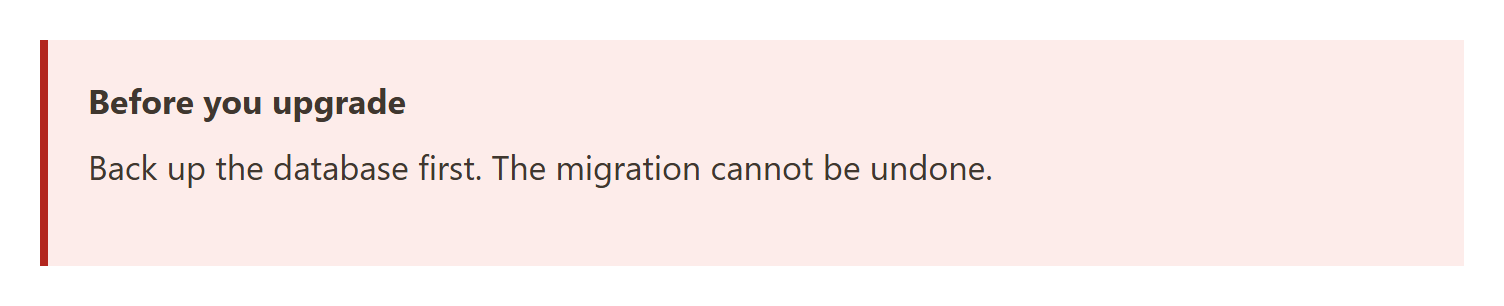
On the front end the toggle shows as the red variant.
Notes on the settings controls:
- Every attribute that is not read back out of the HTML is stored in the block comment. So if you write block markup by hand and leave an attribute out, it falls back to its default, the saved HTML no longer matches, and the editor marks the block invalid.
initialOpen: falsecollapses a panel by default. That helps once a block has several panels.- Use
InspectorControlsfor options, not for content. Text the reader sees belongs in the canvas, where authors can edit it in place. - Changing
saveinvalidates posts that already contain the block. Therefore add adeprecatedentry when a block is already in use on a live site. - The same dependency rule applies as in enqueueing CSS and JavaScript in WordPress: name every package the script relies on, or it will run too early.